ROC Curve
introduction
在信号检测理论中,接收者操作特征曲线(receiver operating characteristic curve)是一种坐标图式的分析工具,用于(1)选择最佳的信号侦测模型,舍弃次佳的模型(2)在同一模型中设定最佳阈值。
ROC分析的是二元分类模型,也就是输出结果只有两种类别的模型,例如:(阳性/阴性)(有病/没病)等。
术语
| 真实值 | 真实值 | 总数 | ||
|---|---|---|---|---|
| p(positive) | n(negative) | |||
| 预测值 | p’ | 真阳性(TP) | 伪阳性(FP) | P’ |
| 预测值 | n’ | 伪阴性(FN) | 真阴性(TN) | N’ |
| 总数 | P | N |
真阳性(TP):正确的肯定,诊断为有,实际上也有癌症。
伪阳性(FP):错误的肯定,诊断为有,实际上却没有癌症。第一型错误。
真阴性(TN):正确的否定,诊断为没有,实际上也没有癌症。
伪阴性(FN):错误的否定,诊断为没有,实际上却有癌症。第二型错误。
真阳性率(TPR, true positive rate),又称为 命中率(hit rate),敏感度(sensitivity)
TPR = TP / P = TP / (TP+FN)
伪阳性率(FPR, false positive rate),又称为 命中率,假警报率 (false alarm rate)
FPR = FP / N = FP / (FP + TN)
真阴性率(TNR), 又称为 特异度(SPC, specificity)
SPC = TN / N = TN / (FP + TN) = 1 - FPR
准确度 (ACC, accuracy)
ACC = (TP + TN) / (P + N), 即:(真阳性+真阴性) / 总样本数
阳性预测值 (PPV):PPV = TP / (TP + FP)
阴性预测值 (NPV):NPV = TN / (TN + FN)
假发现率 (FDR):FDR = FP / (FP + TP)
ROC曲线
x轴:伪阳性率(FPR); Y轴:真阳性率(TPR)
给定一个二元分类模型和它的阈值,就能从所有样本的(阳性/阴性)真实值和预测值计算出一个 (X=FPR, Y=TPR) 座标点。
例如:假设有100个癌症病人和100个正常人,miR-X的表达值为0,0.1,…10.5的200个值。
我们假设一个阈值:0.5以上为预测有癌症,0.5以下为预测没有癌症的。
| p | n | ||
|---|---|---|---|
| p’ | TP=63 | FP=28 | 91 |
| n’ | FN=37 | TN=72 | 109 |
| 100 | 100 |
TPR = TP/(TP+FN) = 63/(63+37) = 0.63,FPR = FP/(FP+TN) = 28/(28+72) = 0.28
如果我们调整一个阈值:0.3以上为预测有癌症,0.3以下为预测没有癌症的。
| p | n | ||
|---|---|---|---|
| p’ | TP=77 | FP=45 | 122 |
| n’ | FN=23 | TN=55 | 78 |
| 100 | 100 |
TPR = TP/(TP+FN) = 77/(77+323) = 0.77,FPR = FP/(FP+TN) = 45/(45+55) = 0.45
完美的预测是一个在左上角的点,在ROC空间座标 (0,1)点,X=0 代表着没有伪阳性,Y=1 代表着没有伪阴性(所有的阳性都是真阳性)。
将同一模型每个阈值 的 (FPR, TPR) 座标都画在ROC空间里,就成为特定模型的ROC曲线。
Draw ROC curve using single feature
When we use single feature to draw ROC curve, we need to install and include pROC and ggplot2 package. The data we will be using is displayed below:
| SampleID | Expression_of_miR-1 | Type |
|---|---|---|
| 1 | 66 | cancer |
| 2 | 32 | normal |
| 3 | 73 | normal |
| 4 | 82 | cancer |
| 5 | 61 | normal |
| 6 | 71 | normal |
| 7 | 50 | normal |
| 8 | 41 | cancer |
| 9 | 67 | normal |
| 10 | 45 | normal |
| 11 | 91 | cancer |
| 12 | 72 | normal |
| 13 | 20 | normal |
| 14 | 85 | cancer |
| 15 | 10 | normal |
| 16 | 74 | cancer |
| 17 | 53 | cancer |
| 18 | 41 | normal |
| 19 | 22 | normal |
| 20 | 49 | cancer |
Here, we present a single feature model. In the data, the first column stands for the ID number for each sample. The second column stands for the expression value of a certain kind of miRNA. The last column represents whether this sample comes from a normal person or a cancer patient.
First we are going to input the data using data.frame. The code is as follows:
SampleID <- c(1, 2, 3, 4, 5, 6, 7, 8, 9, 10, 11, 12, 13, 14, 15, 16, 17, 18, 19, 20)
Expression_of_miR-1 <- c(66, 32, 73, 82, 61, 71, 50, 41, 67, 45, 91, 72, 20, 85, 10, 74, 53, 41, 22, 49)
Type <- c("cancer", "normal", "normal", "cancer", "normal", "normal", "normal", "cancer", "normal", "normal", "cancer", "normal", "normal", "cancer", "normal", "cancer", "cancer", "normal", "normal", "cancer")
SampleData <- data.frame(SampleID, Expression_of_miR-1, Type)
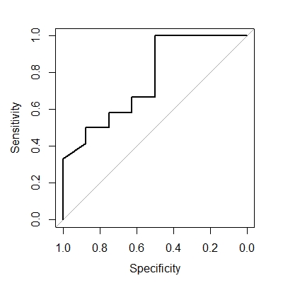
Then using special function roc to construct ROC curve and use plot function to display the curve:
rocobj <- roc(SampleData$Type, SampleData$Expression_of_miR-1)
plot(rocobj)
The curve should look like the following. Notice that false positive rate (0 to 1) equals specificity (1 to 0), and true positive rate (0 to 1) equals sensitivity (0 to 1).
Draw ROC curve using multiple features
The following part discusses how to draw ROC curve using R with multiple features. To accomplish this, we should make sure that the ROCR package has been installed and included in the program. We use random forest to construct a model to predict the type. The data we will be using is displayed below:
| SampleID | Expression_of_miR-1 | Expression_of_miR-2 | Expression_of_miR-3 | Type |
|---|---|---|---|---|
| 1 | 12 | 55 | 74 | cancer |
| 2 | 87 | 44 | 46 | normal |
| 3 | 70 | 23 | 56 | normal |
| 4 | 74 | 35 | 69 | normal |
| 5 | 46 | 43 | 59 | cancer |
| 6 | 58 | 31 | 90 | cancer |
| 7 | 55 | 40 | 30 | normal |
| 8 | 33 | 50 | 76 | cancer |
| 9 | 60 | 20 | 34 | normal |
| 10 | 50 | 22 | 11 | normal |
| 11 | 70 | 50 | 60 | cancer |
| 12 | 22 | 60 | 90 | cancer |
| 13 | 68 | 10 | 9 | normal |
| 14 | 90 | 30 | 20 | normal |
| 15 | 10 | 40 | 39 | cancer |
| 16 | 78 | 50 | 23 | normal |
| 17 | 50 | 60 | 82 | cancer |
| 18 | 70 | 33 | 51 | normal |
| 19 | 81 | 31 | 12 | normal |
| 20 | 44 | 11 | 5 | normal |
| 21 | 20 | 56 | 44 | cancer |
| 22 | 51 | 31 | 17 | normal |
| 23 | 40 | 11 | 4 | normal |
| 24 | 30 | 60 | 57 | normal |
| 25 | 81 | 13 | 24 | normal |
Here, the first column stands for the ID number for each sample. The second to the fourth column stands for the expression value of a certain kind of miRNA (1 to 3). The last column represents whether this sample comes from a normal person or a cancer patient. In random forest machine learning, we train the neuron network with 80% of the above data and use the other 20% to test this model and draw ROC curve.
First, we input the data into R using data.frame.
SampleID <- c(1, 2, 3, 4, 5, 6, 7, 8, 9, 10, 11, 12, 13, 14, 15, 16, 17, 18, 19, 20, 21, 22, 23, 24, 25)
Expression_of_miR-1 <- c(12, 87, 70, 74, 46, 58, 55, 33, 60, 50, 70, 22, 68, 90, 10, 78, 50, 70, 81, 44, 20, 51, 40, 30, 81)
Expression_of_miR-2 <- c(55, 44, 23, 35, 43, 31, 40, 50, 20, 22, 50, 60, 10, 30, 40, 50, 60, 33, 31, 11, 56, 31, 11, 60, 13)
Expression_of_miR-3 <- c(74, 46, 56, 69, 59, 90, 30, 76, 34, 11, 60, 90, 9, 20, 39, 23, 82, 51, 12, 5, 44, 17, 4, 57, 24)
Type <- c("cancer", "normal", "normal", "normal", "cancer", "cancer", "normal", "cancer", "normal", "normal", "cancer", "cancer", "normal", "normal", "cancer", "normal", "cancer", "normal", "normal", "normal", "cancer", "normal", "normal", "normal", "normal")
SampleData <- data.frame(SampleID, Expression_of_miR-1, Expression_of_miR-2, Expression_of_miR-3, Type)
Set random seed so that the repeatability is ensured.
set.seed(123)
As we are trying to make the model predict whether the sample comes from a healthy person or someone with cancer according to the expression value of miRNA, we should input our data without telling the type of each sample. In other words, we will remove the last column of the data. Meanwhile, we need to store all the types in another factor.
all_data <- SampleData[, 1:(ncol(SampleData) - 1)]
all_classes <- factor(SampleData$Type)
As mentioned above, we choose 80% data to train our model and other 20% as test. We can perform this task using the following code:
#Choose 80% of data randomly
n_samples <- nrow(all_data)
n_train <- floor(n_samples * 0.8)
indices <- sample(1:n_samples)
indices <- indices[1:n_train]
#Transfer data from all_data to separate data frame
train_data <- all_data[indices, ]
train_classes <- all_classes[indices]
test_data <- all_data[-indices, ]
test_classes <- all_classes[-indices]
Then we can train our random forest model with 100 trees and predict the type of test sample. We can also set ‘cancer’ as our positive class.
rf_classifier = randomForest(train_data, train_classes, trees = 100)
predicted_classes <- predict(rf_classifier, test_data)
positive_class <- 'cancer'
In order to draw ROC curve, we should also include the real type of test sample and the probability predicted by the model. This can be generated by the following code:
#Calculate the probability
predicted_probs <- predict(rf_classifier, test_data, type = 'prob')
#Find the test data's real class, and compare with the predicted class
test_labels <- vector('integer', length(test_classes))
test_labels[test_classes != positive_class] <- 0
test_labels[test_classes == positive_class] <- 1
pred <- prediction(predicted_probs[, positive_class], test_labels)
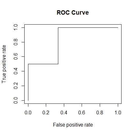
Then, we can obtain the ROC curve by the following code:
roc <- performance(pred, 'tpr', 'fpr')
plot(roc, main = 'ROC Curve')
The curve should look like this:
Reference
[1] Fawcett, Tom. “An Introduction to ROC Analysis.” Pattern Recognition Letters 27.8 (2006): 861-74.
[2] Olivares-Morales, Andrés, Oliver Hatley, J. Turner, D. Galetin, David Aarons, and Aleksandra Rostami-Hodjegan. “The Use of ROC Analysis for the Qualitative Prediction of Human Oral Bioavailability from Animal Data.” Pharmaceutical Research 31.3 (2014): 720-30.
[3] Robin, Xavier, Turck, Natacha, Hainard, Alexandre, Tiberti, Natalia, Lisacek, Frederique, Sanchez, Jean-Charles, and Muller, Markus. “PROC: An Open-source Package for R and S to Analyze and Compare ROC Curves.” BMC Bioinformatics 12 (2011): 77.
[4] https://lulab2.gitbook.io/teaching/part-iii.-machine-learning-basics/8.1-machine-learning-with-r